Built to Move
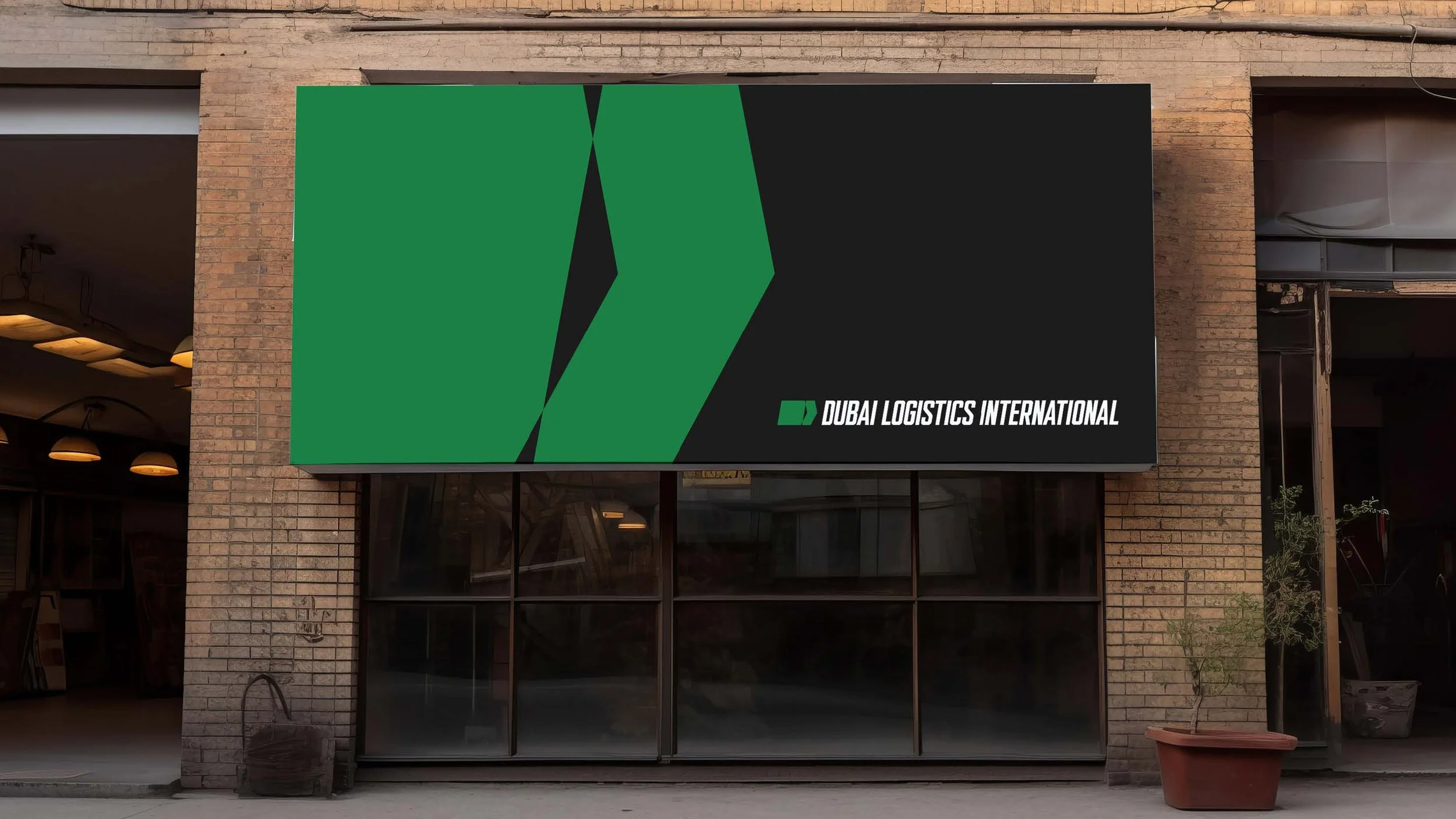
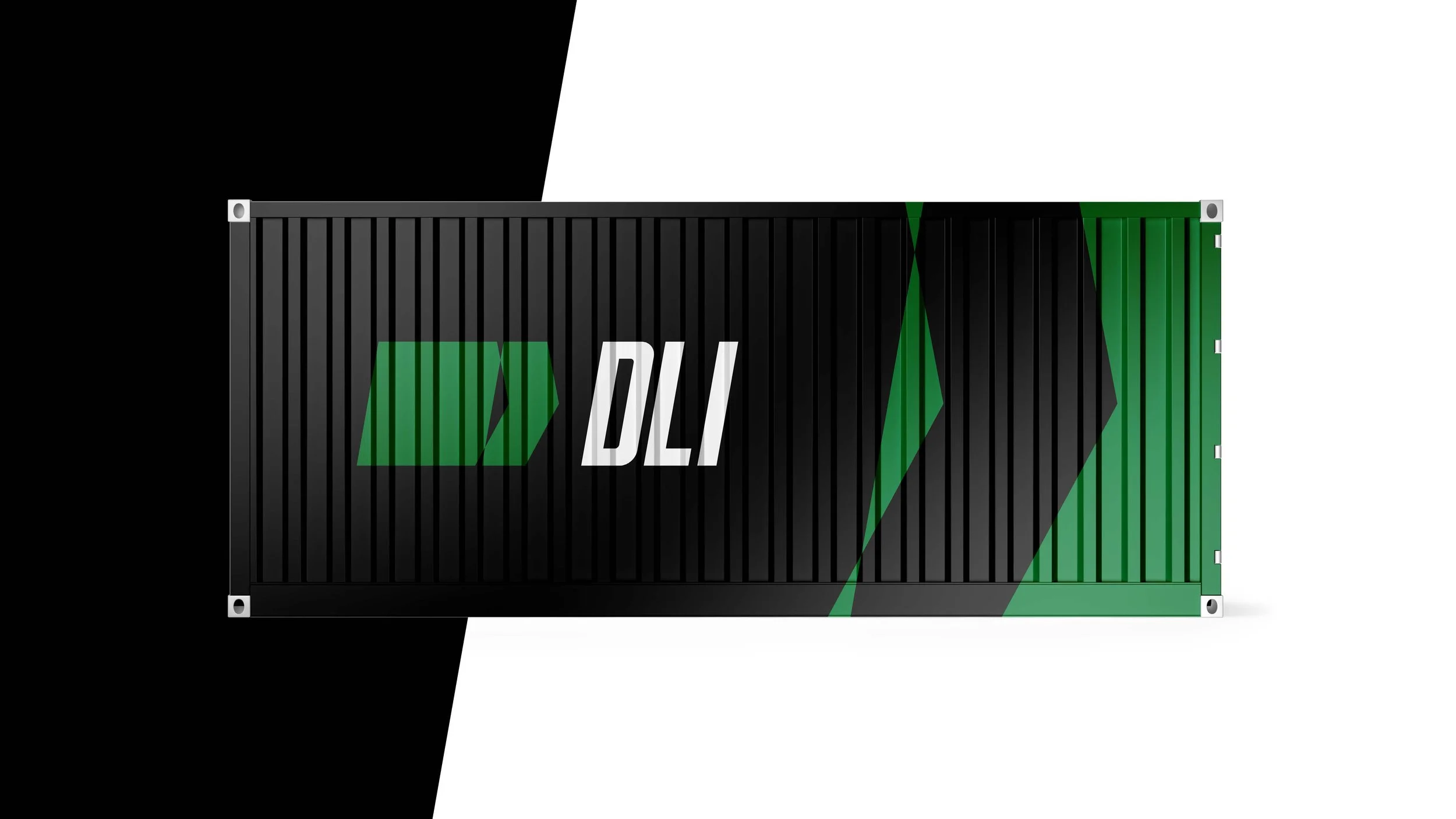
Dubai Logistics International needed a brand identity that could carry weight, literally. The brief called for a mark that would work at scale across trucks, containers, uniforms, signage, and environmental applications, while communicating the core values of a modern logistics operation: precision, reliability, and momentum.
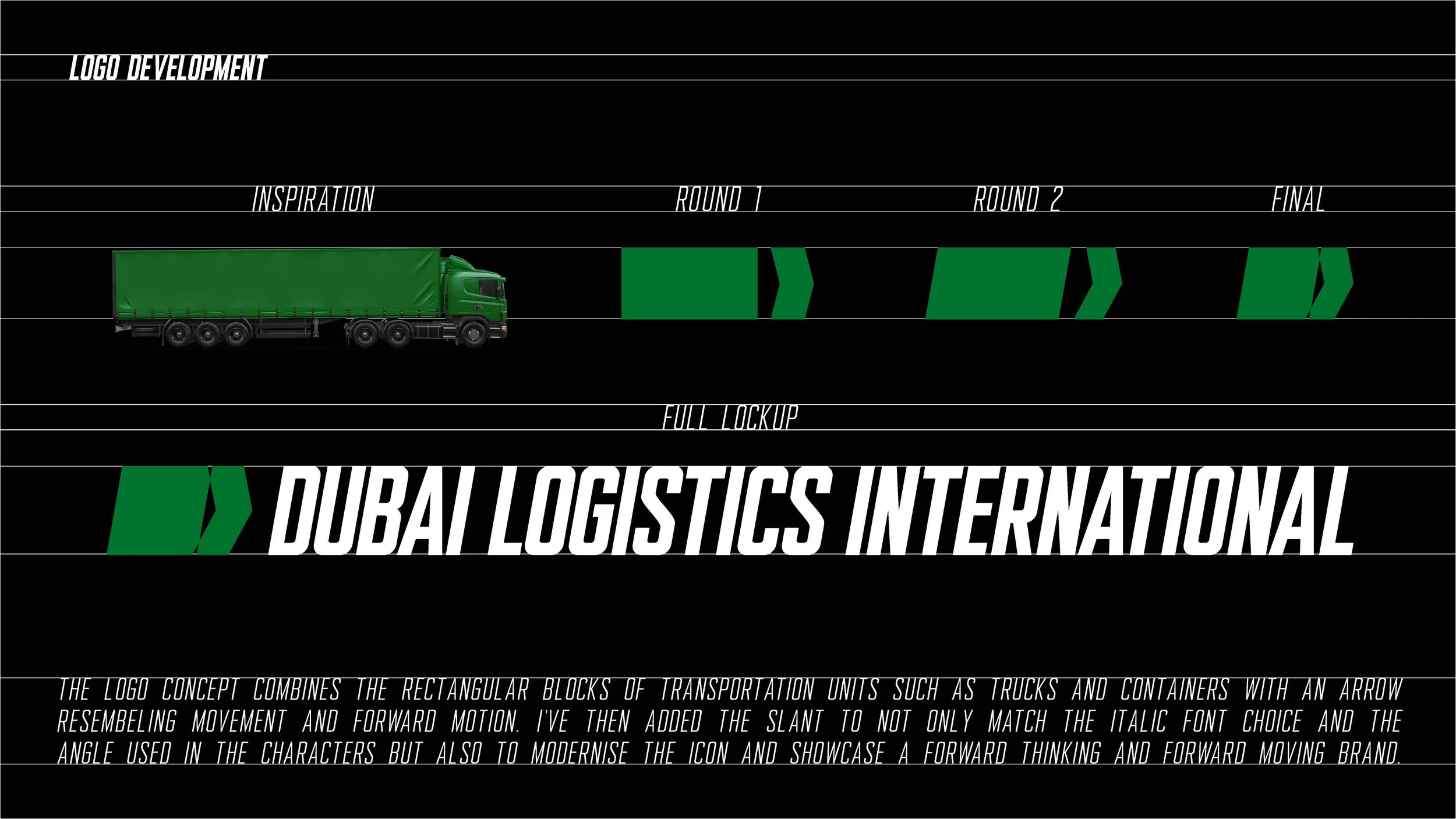
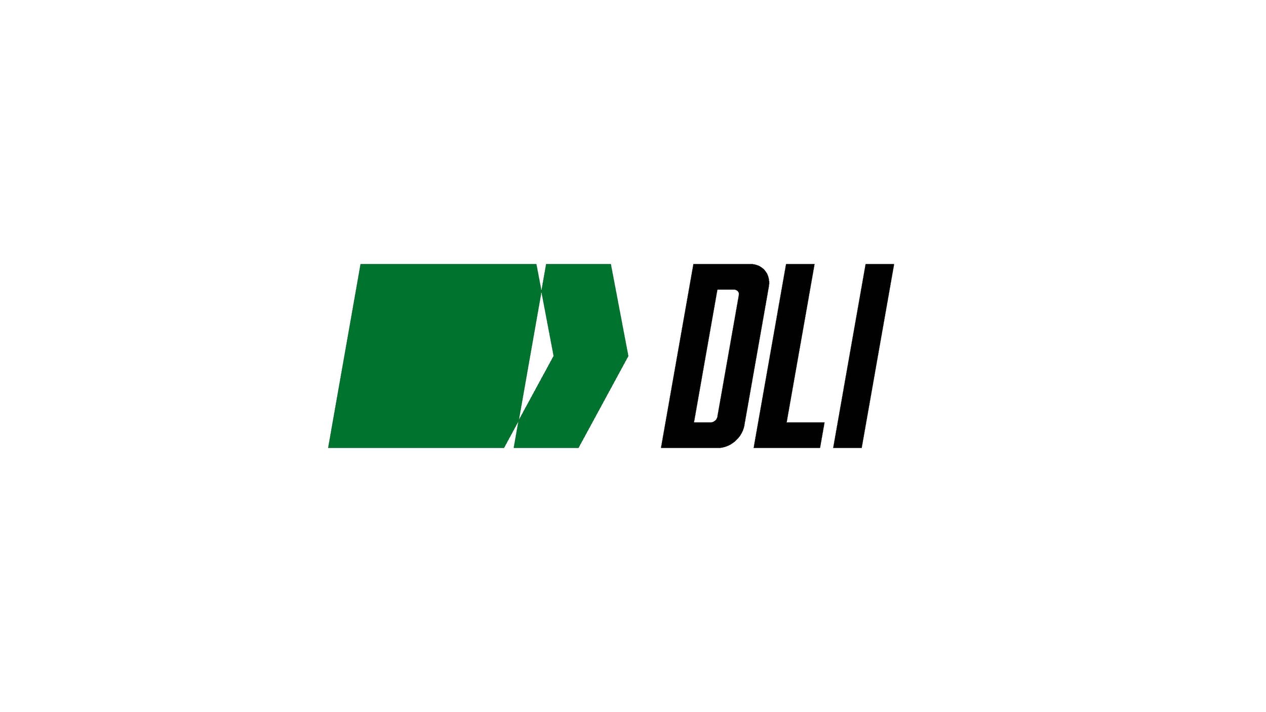
The icon combines the rectangular geometry of shipping containers and transport units with an arrow form suggesting forward movement. A consistent slant runs through both the icon and the typographic choice, giving the identity a unified angle and a sense of direction at every scale. The palette is deliberately lean, UAE green, black, and white, anchored in the geography of the brand while remaining sharp and functional across all applications.
The system was developed with physical deployment in mind from the start: vehicle livery, container graphics, hard hats, uniforms, wayfinding, and outdoor signage. The result is an identity that scales from a chest badge to the side of an articulated lorry without losing its clarity.